Friday, August 28, 2009
Ted
Ted, acylic/pencil on wood, 6x6"
This is my first self-driven "assignment" - a portrait of the dear departed Ted Kennedy. So many well-known figures have died this summer, and often after reading news of another death, I am temporarily fixated. Do other people do this? After Michael Jackson's death I spent way too much time on the internet reading up on him, not to mention watching all the youtube music videos - including Thriller, multiple times. Something similar has happened in the past few days with Ted Kennedy. Obviously, there are way fewer music videos to watch on youtube, but I'm so intrigued by everything I've read about him. I don't know a lot about politics, but I've watched enough news parody programs/Saturday Night Live skits to know a few things. I read through Kennedy's obituary on nytimes.com last night, though, trying to get a sense of why people speak so fondly of him, and I found out quite a lot! Here is my favorite quote they posted of his, from after he lost the 1980 Democratic presidential primary.
“For me, a few hours ago, this campaign came to an end. For all those whose cares have been our concern, the work goes on, the cause endures, the hope still lives and the dream shall never die.”
Thursday, August 27, 2009
zebras and going back to school
"Jason and Peanut dress alike on Wednesdays"
I finished this one a week ago. Now I have four kids + animals paintings! It's very exciting to see them all together. It's also confusing...I want the paintings to all have a similar "look" but I don't think they really do. They all have a child, and an unusual pet, and that's all well and good, but the way they're painted isn't similar enough for me. I'm not sure.
Meanwhile, I start teaching again in two weeks, and I need to start strategizing about how I'm going to keep myself motivated to create when I'm not at school. Last year I did pretty well painting on week nights, but I didn't complete anything too big or exciting...mostly it was just little exercises at abstract stuff, which is still so hard for me. I plan on taking an Editorial Illustration class starting in October, that meets once a week for two months, which will help.
Tuesday, August 18, 2009
Bears and Goldfish
Sunday, August 16, 2009
Found on Etsy: Pins
As seen on: thepinpals, amypanda, ohmycavalier, jeunebugs
In Julie & Julia, the Amy Adams character is constantly wearing pins. I think I'd like to start being a pin-wearer. What do you think? Can I pull this off? I'm not particularly hip/gutsy, but I have high aspirations for myself when it comes to fashion. I have several badges collected from various etsy sellers and groups I'm a part of, and those are nice, but some are mostly advertising. So I have been collecting a list of pins on etsy, and even purchasing a few favorites. They're mostly so affordable! I think this might really work out.
Painting vs Illustration
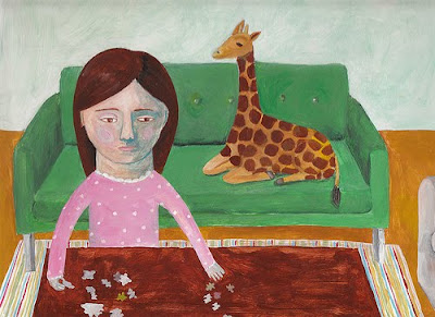
Donna and Herman Start a Puzzle, acrylic on wood panel, 9x12".
I'm very pleased with how this one turned out. I have this idea of several paintings where children have unusual pets. (It's mostly because I myself am constantly wanting to take all the animals from the zoo home with me.) So first I had Joan in the Kitchen with her pet bear, and now I have Donna with her pet giraffe, Herman.
What is it that makes something an Illustration? This painting feels like an illustration, and I'm not totally sure why. Perhaps it's the fact that it's a complete scene, instead of just a character and a plain background, like so much of what I've been doing lately. I could see it in a children's book. It's not a bad thing, per se, but it's not what I was going for. What is the difference between Fine Art and an Illustration? Obviously, what an illustrator creates is art, in itself, but still. Why do some creations get called "illustrations" while others are just "artwork" or "paintings"?
Wednesday, August 12, 2009
Joan in the Kitchen
Joan in the Kitchen is my new favorite painting. There are lots of potential issues with it, I suppose, in terms of composition/contrast, but I'm so pleased with it. I like the way she kind of sinks into the background, and the way the bear sticks out. The most exciting part is how it's a little fanciful, and how it seems like it's telling a little story. I know what story I have in mind, and why the bear/dishes are there, but another viewer could have a totally different idea.
Thursday, August 6, 2009
more portrait plaques
I worked on more portrait plaques yesterday, ending up with two new ones that have a fairly different quality from the others. They have this watercolor/pastel look about them...I'm not sure how I feel about it.
I also made a larger painting (7x10" MDF) where my goal was for the first time to make one of these little portraits have a body. I'm still working on figuring out backgrounds though...I tend to just want some striped wallpaper and call it a day. This is a little more detail than I usually add, but still very very little!
Wednesday, August 5, 2009
natural history museum inspiration
A few months ago I started craving a visit to the Museum of Natural History here in New York. I wanted to see those lush, old, retro-colored dioramas filled with stuffed animals. After many failed attempts to organize a trip, the big day arrived yesterday.
What's not to love about these dioramas? (Except for the depressing part about the dead animals/taxidermy, and seeing baby animals and wondering how those were collected...Let's ignore that part.) The aesthetic is fantastic! And there are so many different hallways and exhibits to walk through! The bears will always be my favorite, but the African Mammals exhibit was amazing as well. Two floors of all sorts of familiar and unfamiliar creatures, like elephants and ostrichs and greater and lesser koodoos and elands (a word I know only from crossword puzzles) and so many more.
The highlight of the visit, besides the diaromas, was seeing a special exhibit called Extreme Mammals. We learned about the biggest and smallest mammals, yes, but the best part was seeing lots of creepy weird mammals that went extinct thousands of years ago...beavers with horns, whales with four legs, and a wooly mammoth-type monster with a long silly gonzo nose, to name a few. We watched sugar gliders hop around a little mini-environment, and discussed the pros and cons of having baleen instead of teeth. Just fyi: humans are apparently the only two-legged mammals who "walk" - I think all the others hop? Or most of the others hop, and some do other things? Still. We are unique!
Meanwhile, I'm still working on finding a local place to show some art. I have organized the results, but there is a bit more fact-finding to do before I narrow it down to a few places to actually approach. I started working on my artist statement, and am varnishing a few pieces that I want to move out of here. More information to come!
Saturday, August 1, 2009
Game on!
Today I go on my first fact-finding mission throughout the area, looking for potential venues for showing/hanging/selling artwork. Coffee shops, diners, small stores...Game on!
Normally I'd make a nice template that I could fill out for each location, just so I could stay super organized. Unfortunately, my computer and printer are no longer speaking so I am going to have to take notes in a little notebook with no formatting whatsoever. Still, exciting, no?
Things I will consider:
1. Does the venue already have artwork on its walls? If so, what kind?
2. Does it seem like my artwork would fit with the venue's vibe?
3. How crowded is the venue? How many people will be seeing my artwork?
4. What kind of customers come to this venue? Families/yuppies/hipsters?
After I've gathered the information, I plan on choosing my top 3 venues and organizing everything I need to approach them about my artwork. I might have some brochures/flyers made. It's very exciting! And I need to work on an artist statement so I can join the local artist group here.
Subscribe to:
Posts (Atom)